Why
My old portfolio was fine. Cards, gradients, a rotating avatar, a parallax hero driven by framer-motion. It looked like every other portfolio in 2024, which is precisely the problem — “fine” is the death of distinctiveness.
I wanted the site to do one thing: make someone who opens it remember me for ten seconds longer than average. That’s the whole goal of a personal site. Anything past that (SEO, conversion, “thought leadership”) is a bonus. The ten seconds are what count.
So I picked an aesthetic that commits: a monospace terminal. Phosphor green on near-black in dark mode, ink on warm paper in light mode. Cmd+K as navigation. A boot sequence instead of a splash. Every page framed as a terminal artifact — experience as a git log, projects as ls -la, 404 as stderr.
This post is about the decisions, the parts that actually shipped, and the one Tailwind bug that nearly ate an afternoon.
The tension I was solving
“Distinctive” and “not gimmicky” sit on opposite ends of one axis. Lean too far toward distinctive and you get portfolios that look like Geocities rewrites — memorable for the wrong reasons. Lean too far toward not-gimmicky and you get the card-grid portfolio that everyone’s seen 200 of.
The terminal aesthetic is an interesting point on that axis because it reads as identity, not costume. I actually live in a terminal. JetBrains Mono is my editor font. The site is what my brain’s chrome already looks like. It’s distinctive to visitors precisely because it’s not decorative for me.
The rule I kept reminding myself: if a design choice exists only to look cool, cut it. If a design choice exists because it’s genuinely how I work, keep it and commit harder.
What shipped
Typography
VT323 for display — a bitmap CRT font that lands hard at large sizes and disappears at body sizes. Paired with JetBrains Mono for everything that needs to be read. The hero name, the $ ls ./skills section labels, the 404 glyph — all VT323. Everything else JetBrains.
Avoided: Space Grotesk, Inter, Outfit, anything that would’ve made the site read “generic dev portfolio” the moment you saw the first heading.
The Cmd+K command palette
Terminal theme + not having a Cmd+K palette would’ve been malpractice. Hit ⌘K / Ctrl+K / / anywhere to open a fuzzy-searchable palette of pages, posts, socials, and actions (toggle theme, copy email, view source). Full keyboard nav.
This was the component I most suspected users might miss. Added a [ search ⌘K ] hint in the top bar so even non-keyboard users see it exists. Mobile gets a small search icon that opens the same palette — tap instead of hotkey.
Implementation notes:
- React island with
client:idleso it doesn’t block page nav. The palette hydrates during idle time. - Custom fuzzy-score function (exact match > startsWith > substring > subsequence). Didn’t need Fuse.js; ~30 lines of code.
- Indexes posts via a tiny
/posts.jsonendpoint generated at build.
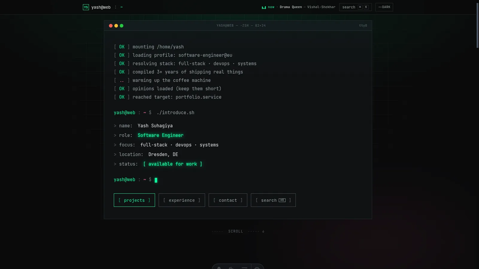
The boot sequence hero
On page load:
- Window chrome renders (macOS-style red/amber/green dots,
yash@web — -zsh — 82×24title). - Seven boot lines stream in over ~1 second (
[ OK ] mounting /home/yash…). - A fake REPL fires:
$ ./introduce.sh. - Five lines type out character-by-character: name, role, focus, location, status.
- CTA row fades in.
- Blinking cursor on the final prompt.
The whole thing clocks in around 3 seconds from navigation to interactive. Respects prefers-reduced-motion — if set, everything renders in final state immediately. Zero tradeoff between “cool entrance” and “accessible”.
Every page reframed
/experience— year-anchored timeline. Year on the left as the scan anchor, dashed rail in the middle, company + role + dates on the right. Active roles get a pulsing node and aHEADtag. The earlier version of this page had fake commit hashes on every entry; I cut them in v2 because they were clutter disguised as flavor./projects—ls -laoutput. Real Unix columns: mode, stars, forks, modified, name./contact— acompose.shwindow with phospshor-bracketed radio pills for subject:[ general ],[ job opportunity ],[ freelance work ]./posts—ls -ltlisting. Date, read time, title, post number./posts/[slug]— post body wrapped in~/posts/slug.mdfile chrome./404—stderrwindow. “bash: /foo: No such file or directory” with[ cd ~ ]escape button.
Live now-playing widget
The small green equalizer bars in the top right of the navbar are a Last.fm-backed now-playing widget. Polls /api/nowplaying.json every 15 seconds (pauses when the tab is hidden, resumes on focus). When a track is playing it shows ▌▌▌ now · Track — Artist with animated bars; when idle, it shows the most recently played track in muted grey.
Why Last.fm and not Spotify? Because as of February 2026, Spotify requires the app owner to have a Premium subscription for their Web API to work at all — a policy that makes no sense for a personal-site use case. Last.fm’s API is free, has been for 15+ years, and every Spotify account I know already scrobbles to it.
The favicon
Black rounded-square terminal screen, phosphor-green > prompt, phosphor-green cursor block. Rendered sharp at 16×16 thanks to pixel-aligned coordinates and a chunky 3px stroke. One of the smallest files in the repo, one of the decisions I’m most satisfied with.
The Tailwind bug that nearly ate an afternoon
Worth a standalone section because it taught me a thing I’ll remember forever.
I had a color token called base in my Tailwind config — the page background. Perfectly normal:
colors: {
  base: 'rgb(var(--color-base) / <alpha-value>)',
  surface: 'rgb(var(--color-surface) / <alpha-value>)',
  // ...
}
Company names in one section of the homepage were rendering near-invisible. Dark text on near-dark background. Inspecting showed color: rgb(10, 10, 11) — the base color — applied somehow, despite the class being text-text-primary.
I tried the obvious:
- Overriding with
!importantinline? Ignored. - Checking specificity?
.text-text-primaryclearly had higher specificity than theatag rule. - Stripping classes one at a time? Bug vanished when I removed
md:text-base.
md:text-base. A font-size utility.
Here’s what happened: Tailwind generates .text-base for font-size (the default: 1rem / 1.5rem). When you register a color key named base, Tailwind also generates .text-base — for color. Both rules have the same selector. They merge. The later declaration wins for each property.
So md:text-base, which I used for font-size, was also applying color: rgb(var(--color-base)) — the very color I used as a background. On every element at md+ breakpoint.
The fix: rename the color key. base → canvas. No more collision. bg-base → bg-canvas in three files.
The meta-lesson is sharper than the specific fix. Tailwind v3’s text-* namespace is overloaded for colors and font-sizes. Any color key that matches a default font-size key (xs, sm, base, lg, xl, 2xl…) creates a silent collision. Tailwind v4 fixes this with namespaced theme tokens (--color-*, --font-size-*) — another reason v4 is worth the migration when you have the appetite for it.
What I didn’t ship
- An actual scrolling “ticker” of recent commits. Prototyped it, felt like a gimmick. Cut.
- Keyboard vim-motion navigation (
hjkl). Tempting for the aesthetic. Also a usability disaster for the 99% of visitors who don’t know vim. Cut. - Per-visitor boot log personalization. “Boot line: visitor from Germany, 14:32 UTC.” Privacy-squeamish, zero value. Cut.
- A “glitch on hover” effect on every link. Tried it. Was noisy. Cut to just the most important hover targets.
The through-line: restraint in service of the aesthetic. Maximalism is easy in a terminal theme; the discipline is deciding which one or two flourishes earn their place, and dropping the rest.
What the next iteration might do
Two ideas I haven’t committed to:
- A “shell history” page at
/.bash_history— every URL visited on the site with a tiny timestamp, like actual shell history. Fun and on-brand. Unclear if anyone would use it. - A built-in mini-shell — click any
$ commandon the site and it runs against a tiny sandboxed command set (ls,cat,whoami,cd). Pure novelty. Hard to stop at “fun” before hitting “bloat”.
If I ship either, I’ll write it up.
The closing bit
My old portfolio was a product of copying the current meta. My new one is a product of committing to one specific aesthetic that actually reflects how I work. That’s the whole thesis of why I did this — design for yourself first, and strangers will come along if the voice is real.
If you want the source, it’s at github.com/yashsuhagiya/portfolio. If you want to argue about any of the choices, drop me a line. And if your portfolio currently has a gradient hero and a rotating avatar — no judgment, but you already know what I’m going to say.
exit 0